What is a “KN” Car?
How “KN” Came From “KIA”
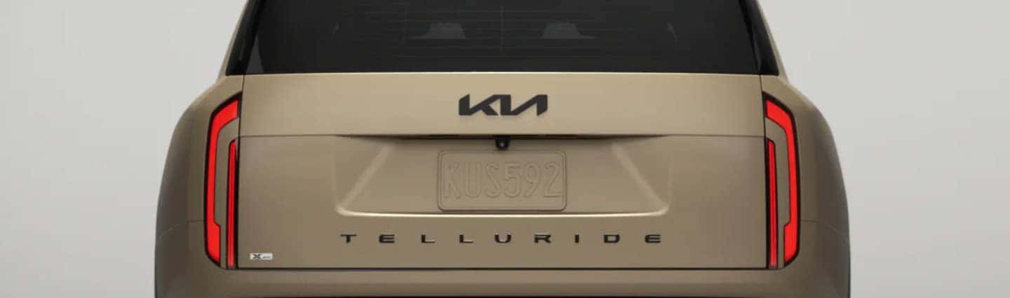
In 2021 Kia unveiled a new logo to coincide with the brand’s commitment to becoming an icon for change and innovation.The sleek new logo represents “‘symmetry’, ‘rhythm’ and ‘rising’ elements that embody Kia’s confidence and commitment to customers” and was launched in conjunction with a new tagline: ‘Movement that inspires’. Many people tell us it looks like a KN, and we can’t really disagree, it does look a little like a ‘K’ and backwards ‘N’!
![]()
Discover our inventory of new and used ‘KN cars’ at Bridgewater Kia today — including the Telluride, EV6, K5, K4 and more! View Inventory.
A Brief History of the Kia Logo
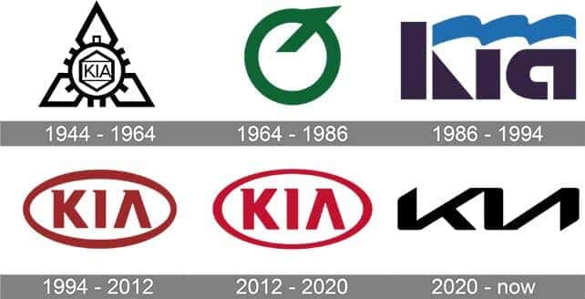
1944-1964: The original logo had three diamonds overlapped by a circular gear, inside which was a hexagon. Inside the hexagon was a rectangle with the word “KIA” in capital letters.1964-1986: During this period, the logo was composed of a green circle with a diagonal line protruding from the top right corner — it looked like an upside-down “Q.”
1986-1994: At this time, the logo was a series of stylized shapes. The “K” consisted of a thick black line and triangle, while the “I” and “A” were made of single thick lines that formed letter shapes. Floating over all three was a wavy blue banner.
1994-2012: The logo most familiar with the brand was made up of a red oval, inside which was the word “KIA”. Red represented Kia’s passion and energy, while white stood for purity and loyalty.
2012-2020: The previous logo was refined slightly with a brighter red and bolder, sharper lines.
2020-NOW: Highly stylized angular strokes denote movement, symmetry and rhythm.